
Hi Christian. I think we need a new font. I don’t like this one. It is staid and dull. I propose Calibri. Or Futura. Either one signifies a new age, one of exploration and adventure and surefootedness, while acknowledging the importance of tradition through their crisp and clearly defined lines. Whatcha’ think?
Christian: Before I give you my argument, I think we need to give our treasured readers a little insight into the PCPPP writing process. I’m sure most of you picture Pat and I sitting behind large grandiose mahogany or ebony carved desks surrounded by shelf upon shelf of expensive leather bound books of great length, as we dip our quills into ink extracted from the rarest of squids, and scribe each PCPPP blog post as we sip from our brandy snifters.And I’m sure you then imagine how upon finishing a post, we hand our parchments of paper, that have each been wax stamped with our family crests, to one of our many attractive secretaries whose task it is to publish our works onto the internet, and then kick our legs up onto our rhinoceros skin ottomans and enjoy the finest of colonial period cigars.
Well, it’s more or less like that. But one difference is that we use shared Google docs to do our madcap back and forth writing exposes (We’re currently in the works for trying to patent back and forth writing so don’t even think about doing it). We then copy the contents of the Google doc (We’re also trying to patent Google docs) into our blog and viola! PCPPP magic is birthed. And when I say ‘We copy’ I mean ‘I copy’ because another thing that should probably be known to our dearest readers is that Pat is what I like to politely call “tech dumb” (Patenting this too people).
Don’t take this the wrong way Pat. Your skills just lie in other areas. That’s all.

This guy’’s skills lies in other areas too. Am I right ladies?
Now that I have filled our readership with the proper background I can address your suggestion about changing our font. No. I don’t think we should. And here’s why...
First off, since we are using Google docs we are limited to a select few fonts to choose from. Futura isn’t one of them. Sure there might be a way to get more choices into Google docs and sure there’s the option of changing the font after it is copied into blogger but both would require effort. Effort I just can’t get behind.
As for your second suggestion of using the font Calibri - yes this font is available in Google docs and as you can see this paragraph is being written in it. And now I have a migraine. I don’t think this font is as nice to read as the pleasurable Arial that we have all grown to love and adore in an "just friends” kind of way. In fact I better switch back to that sophisticated yet whimsical Arial before I vomit all over my keyboard.
Ahhhhh... there she is. Much better.
And my last argument against changing fonts lies in the fact that, as I think you are aware Pat, our blog is posted on the internet. Sometimes referred to as the web. I don’t want to get into the technical details here but there is a concept of web safe fonts. Kind of like safe sex but with letters and numbers instead of extreme pleasure and mayonnaise.
A font is considered to be web safe if it is a very commonly used font across the different computer systems. The reason is, at the basic level of web stuff (non-technical term) any font you see while browsing the internet has to actually be loaded on your computer otherwise it won’t render. Nowadays there are ways around this but it is still a good idea to stick with web safe fonts.
And guess what? Arial is a web safe font (Is there nothing she can’t do?).
Oh dear god, look what you’ve made me do Pat. I’ve become informative. *shudders* People who are reading this blog now might be actually learning something. I apologize for that dearest readers. I never meant it to happen.
So Pat, are you cool with sticking with Arial? I think she’s “the one”.
Pat: Umm...okay. Sorry. I just thought it might look nice. I didn’t know, y’know, that it got all complicated and techie and all. Sorry. I won’t ask again.
Christian: Well shoot, now I feel bad. I didn’t mean to rain on your new exciting font parade but... wait a sec. Are you underlining your name now? Is this just to spite me because of this font thing?
Pat: Yes, yes I am, and yes it was, but then I tried this new backlighting shadowy thing, and now I’m stuck Christian, and I can’t get out of it and make it go away and I’m really sorry, but I’m kinda’ freaking out ‘cause it won’t stop, and I was only trying to be funny and I really won’t ever bring it up again if you can just make this stop. I really don’t like this...it’s like when you took me to that bar and promised me that the jello was just offered in bite sized servings so I had a lot of them and then felt really funny. Help.
Christian: See what happens when you play with fire. I think it’s best that we just leave everything as is, before you end up breaking the internet.
However I don’t want you to feel bad about your lack of technical knowledge (see “tech dumb” above). Yes, nowadays it’s pretty common for most people to use a computer on a daily basis, but I’m sure there are other people, such as yourself, that have difficulty with them and at times feel a bit overwhelmed. I guess not everyone can be computer savvy. But don’t fret it. I feel like over time, someday you’ll get there.
Below are some examples of confident computer users that don’t accidentally get themselves stuck highlighting text and become distressed.


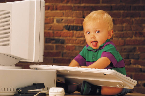
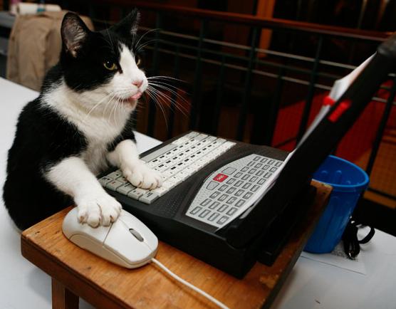
But there isn’t anything saying that over time, as you get more experience, you can’t be part of this group too, Pat. Until then don’t worry about it.
I kind of like the Calibri font, as long as it is not intermixed with Arial. I don't think they make an attractive couple.
ReplyDeleteI do love mayonnaise, though!
Hopefully someday our society won't frown upon inter-racial font matchings. But until then I totally agree with you.
DeleteI think the guy leaning back with his hands behind his head just figured out how to un-highlight his text. He just has a look of satisfaction that screams "I learned how to do something after working way too hard at it!"
ReplyDeleteYou're totally right! Pat often has that look.
DeleteNo...that's not that look at all! That dude is totally posing for some hot on-line chatter on the other end of his screen. I might know something about that look, too.
Delete2 things- why does everyone hate comic sans? And I prefer the phrase "tech sexy" instead of "tech savvy".
ReplyDeleteAnd another thing- homemade mayonnaise is soooo good.
Oooh, I like "tech sexy" too. e.g. My parents are totally not tech sexy.
DeleteAIOLI!!!!!!!!
DeleteOOOOOOh but guys there is so much you can do with the new CSS3 these days! You can add shadows, choose your own font and even! do animations and transitions all without first-hand knowledge of higher order programming!!! I would totally offer to do it for you but I personally think Arial is just fine. (: Aaaaaaaaaaaand I'm kind of lazy.
ReplyDeleteOOOOOOh but guys there is so much you can do with the new CSS3 these days! You can add shadows, choose your own font and even! do animations and transitions all without first-hand knowledge of higher order programming!!! I would totally offer to do it for you but I personally think Arial is just fine. (: Aaaaaaaaaaaand I'm kind of lazy.
ReplyDeleteAlso I am a fan of the mayonnaise too.
CSS3? Shadows? Transitions? First-hand knowledge? Man, that sounds like a lot of work. Plus I'm still not ready to leave Arial.
DeleteYeah...Anna, I have NO idea what you're talking about until you get to the word "lazy". That, coupled with "fan of mayonnaise" appealed to me.
DeleteI've always wondered how that all worked! Thanks for clearing that up! And that man DEFINITELY has other skills.
ReplyDeleteAnd he just might be available, Kelley. And by available I mean living in his parents' basement.
DeleteI'm glad to see that so many others are fans of the mayonnaise too.
ReplyDeletelmao...great post. Who'd have thunk a conversation over blog fonts could be so interesting. Personally I thought the guy with other talents looked very trainable and eager to please, but that's just me. Poor Pat...bow did hee take the baby and cat looking more computer confident than him? I'm guessing he was just jealous about the trainable and eager to please guy.
ReplyDeleteI'm doing okay, Blondie...thanks for asking. I wish I could say otherwise, but I often find that cats have more accomplished and satisfied looks on their faces than I do. It's a cross I bear, but I persevere!
DeleteYour blog is great, this blog is also quite fun, check it out! todayswisdom.tumblr.com
ReplyDeleteWhatever font you use, I will continue reading. You won't be able to get rid of me -- even with penicillin. Also, those first couple paragraphs are EXACTLY how imagine these posts are written; I was SO right.
ReplyDeleteI'm glad your image of our writing process wasn't tarnished. Most people actually think it's even more grandiose than I described and are a little disappointed after hearing how it really works.
Delete